Comfort is part of the composition.
Generous seating, soft upholstery and clear routes through the room take priority over a purely decorative arrangement.

Clean lines.
Natural textures.
A home that feels lived in.
Concept visualisation created for this style guide. Not a completed EmberArc project.
Contemporary describes the clean forms, uncluttered spaces and current approach to living. Warm describes the material palette and atmosphere: timber grain, earthy colour, tactile fabric and gentle light.
It is a design direction, not a fixed historical style. Here, the warmth comes from the materials as much as the lighting.
This direction suits you if you enjoy uncluttered spaces but still want softness, texture and comfortable furniture. It works as a starting point for a family home, a city apartment or a quieter retreat.
If you love ornate detailing, strong colour or a more traditional character, Indian Contemporary or Modern Classic may be closer to your taste.
Generous seating, soft upholstery and clear routes through the room take priority over a purely decorative arrangement.
Timber, stone and warm whites provide a consistent background. Artwork, textiles and a few personal pieces can change the mood without changing the whole room.
Repeat selected materials across the entrance, shaded edges and interior joinery. The result feels connected rather than designed as separate rooms and elevations.
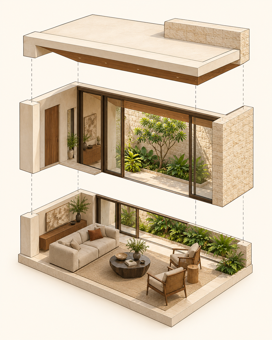
Conceptual material and spatial study, not a measured construction assembly. Selectable annotations; no rotation or zoom.
The feeling comes from proportion, a coordinated palette and a few well-resolved details. It does not require every surface to be expensive.
We can adapt this palette to your rooms, your site and the way you live.
Explore this direction for my project